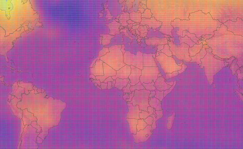
New map shows how different parts of the world are experiencing global warming
A new interactive map by Carbon Brief shows how every part of the world has warmed.

A new interactive map by Carbon Brief shows how every part of the world has warmed.
The map, created by Zeke Hausfather and Rosamund Pearce, combined observed temperature changes with future climate model projections to show how climate change has changed up to present day, but also how it is forecasted to change in the future.
To do this, they divided the world into “grid cells” which represent every degree latitude and every degree longitude. These temperatures, based on land and ocean observations, were obtained from the Berkeley Earth Surface Temperature project.
The map is interactive and you can click on the divided grids to see regions temperature rises. You can also search specific regions to find out their statistics.
Carbon Brief is a UK-based website which covers the latest development in climate science, climate policy and energy policy.
Notably, London, near Westminster, has a global temperature rise of 1.2 degrees Celsius however, it is forecasted to rise to between 1.6 degrees Celsius and 4.5 degrees Celsius.
This is a useful tool in demonstrating what countries are on track to keep the commitment to the Paris Agreement of limiting global temperature rise to 1.5 degrees Celsius. It can also show who needs to implement additional measures to ensure they meet the target set.
Zeke Hausfather took to Twitter to announce the launch of the map. He said: “After a ton of work our @CarbonBrief interactive temperature map is finally done! Browse any location in the world to see how the climate has changed in the past and will change in the future. Data for any location can be downloaded in a csv.”
To use the interactive map to find out your home town’s temperature rise, click here.
Photo Credit: Carbon Brief


